Lenormand Oracle Cards: (Lenormand Box Set with 39 Cards)
L**O
Advertising on each card looks bad
It is a beautiful deck but I got disappointed when I saw the author’s advertisement on the back of each card, it just made the deck look cheap like any other material that is free because the costs are covered by publicity. The back of oracle cards should be neutral with no messages or illustrations that take the mind away. The author seems to be popular, I hope he realised that and get his editor to come up with another version proper for cartomancy.
R**E
Beautiful Lenormand cards
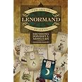
These cards are lovely. They have the corresponding playing card suit as a card image on them and nice clear pictures. I bought the book that accompanies them (separate purchase) as I’m new to Lenormand and am loving both. The cards are regular playing card size, easy to handle, they shuffle and spread well and have a beautiful gilt edge.Definitely glad I got these.
R**R
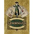
Like a 18th centurt French deck.
This deck is like a deck mademoiselle Lenormand could have used (I know she didn't but she could have). It looks like it is from her time. The style is so typically French simple and elegant. I especially like that one gentleman looks to the right and one to the left, same for the ladies. Easy to read with and is the deck A. Musruck uses in his book.
A**D
Good clear images.
Clear images. Good card stock. Gilded edges are lovely. Be careful when you first flip through the cards as they can stick together. This impoves with use.
Trustpilot
2 weeks ago
3 weeks ago
1 day ago